

How to read a histogram, vectorscope and other color correcting tools.
In this article, you will learn how to read a histogram, RGB Parade, waveform monitor, and vectorscope.
If you are new to videography and/or photography, how to read a histogram will be beneficial as it is an essential tool to understand exposure and validate your image capture. Let’s start with the histogram as it is the basis of reading your exposure. It is a great photography tool that applies to videography since many cameras will this option of in live view.
Histogram
To understand what is being captured, you need to know how to read it. A histogram will generally look like this:

It is divided into sections, the left is the shadows, the middle is the mid-tones, and the right is the highlights. The image information is displayed to you within that graph. The border on the left is your true black and the one on the right is pure white. If you go beyond the borders, your shadows or highlight will be clipping, which means not all information will be recorded, won’t have the optimal capture and will result in a loss of all the nuances without the possibility of recovering that information later. A properly exposed image dictates that you need to keep your graph or your information captured within those boundaries, the closest to the edges you are getting the darker or lighter the color and image captured will be.

Let’s look at the image above and read the histogram. From left to right, in the shadows, we have the green circle which represents the dark window curtains and part of the wall. For the mid-tones in the middle, we have the blue circle, which is pretty much everything that you can clearly see from light shadows like the white trim, the greenery in the window and the tree on the right. Then, we have the blown out highlights circled in red, that information is clipping, this part of the image is overexposed, and, can’t be salvaged.
Waveform monitor and RGB Parade
Now that we know how to read a histogram, it will be easier to understand RGB Parade and Waveform monitor (more precisely the Luma Waveform).
Both tools are similar, it works histogram. The waveform monitor will show you luminance and chrominance of an image, in really plain terms; it shows brightness and contrast of the image.

A typical representation of a Luma Waveform monitor.
The RGB Parade is a color separation shown in a waveform manner, this is particularly helpful to check your white balance and during color correction, as you can have a quick snapshot of if your shot skew in a certain color.

A typical representation of an RGB Parade.
The scale on these tools is from 0 to 100, it goes from Black/Shadows (0) to White/Highlights (100). Again, in the same fashion than the histogram, the lower tier is the shadows area, the middle tier is the mid-tones and the top tier is the highlights. Same as the histogram, if you go past 0 or 100, clipping will occur and the image won’t show all of its detail and information.
Ok! Some of you may argue with this as you have a deeper knowledge of these tools. There are other scales and legal values, but since this is aimed at beginners, to not confuse everyone we will keep it at that! 99% of the time the 0-100 scale will be fine in this digital era.

In this example, let’s start from the bottom up. The green circle represents the curtains on the left, you can see in the waveform all the “waves” created by the curtains pleat and the different light bouncing off it. Then we have all the general information within the graph, the dark areas to the light ones, but we can discern the white railing (blue circle) within it. Then at the top, we have the red circle which shows all the over-exposed areas in the right windows, again, blown highlights that are not recoverable.

With the RGB parade, it is a similar story the Luma Waveform, the information but you can spot the color shifts easily. In this example I’ve circled the white railing section, we can see in the image it has a blue tone to it. Therefore, if you look at the RGB parade you can see the blue channel being above the same information in the green (and red) channels. This is an indication that this element of the image is skewed blue.
Vectorscope
The vectorscope is the odd one of all of them; the tool doesn’t look like any of the other ones. This tool displays the chroma (intensity of colors) in your shot. In a nutshell, it will show you the color saturation and amount of the image. This tool is especially useful in post-production to color correct white balances. It removes all guesstimate of which color you need to counter.

A typical representation of a Vectorscope.
The vectorscope is laid out similarly to a color wheel in a circle with a few reference points for Red, Magenta, Blue, Cyan, Green, and Yellow.How to read it is not hard either, Black, White, and Gray will be registering in the middle. Meanwhile, the color saturation will register from the center out, so the least saturated the color is, the closer to the center it will be. While the more saturated a color is, the closest to the edge your graph will be.
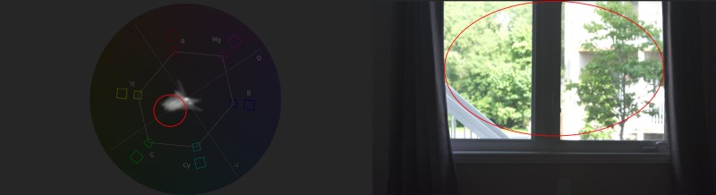
In this instance, if we look at the vectorscope, most of the data shown is leaning toward the green, which is due from most of the shot being trees and greenery (red circle). If you look closely, there are a few lines going toward the blue, those are mostly coming from the curtains.
And that is it for today! We could dive a lot deeper but this will give you a good base to really work and understand these tools. Stay tuned for more content on color correction, color grading, shot matching, etc. in the near future.
Pingback: How to work with LUTs - The Video Pro Guys
Pingback: How to color grade like Game of Thrones - The Video Pro Guys